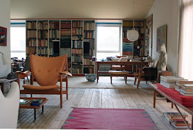
Mid-century Danish
architect/industrial designer Finn Juhl’s house, located in a suburb of
Copenhagen, is a must-see. I'm still not completely sold on Danish furniture,
but seeing Juhl’s designs in their natural habitat, surrounded by his careful
arrangement of objects and inspired color accents in this modest, richly
appointed abode made me a convert.
In the living room, the "Chieftain" chair’s oversized proportions and shield back seemed to reference some ancient Viking past. The one here is a pinkish leather. The diminutive "poet" settee was inviting with its high curved back that looks like it would surround the sitter in an embrace. The graceful and petite "sculptural armchair" spoke to me of Wegner. An elegant shape with a carved curved back, contoured arms and clever "V" shaped support. The design was sufficiently challenging that only 12 were ever made, making them exceedingly valuable. I couldn't like the other armchairs used in the living room and dining room. I think I saw too many of the type in cluttered Upper West Side apartments.
In the living room, the "Chieftain" chair’s oversized proportions and shield back seemed to reference some ancient Viking past. The one here is a pinkish leather. The diminutive "poet" settee was inviting with its high curved back that looks like it would surround the sitter in an embrace. The graceful and petite "sculptural armchair" spoke to me of Wegner. An elegant shape with a carved curved back, contoured arms and clever "V" shaped support. The design was sufficiently challenging that only 12 were ever made, making them exceedingly valuable. I couldn't like the other armchairs used in the living room and dining room. I think I saw too many of the type in cluttered Upper West Side apartments.
But Juhl's use of
Asian ceramics, Scandinavian woven rugs, his collection of artwork, palette,
proportions and modesty of scale was genius. It was these elements, together
with how he treated nature and light that reminded me of Frank Lloyd Wright,
and in particular Wright's Usonian houses, although the exterior, at least,
looks totally different.
I loved the almost
adobe fireplace in the living room and bookshelves which boasted three doored
cabinets and a set of colored drawers.
I think my favorite room was the dining room. Here, one wall is a two sided glass display cabinet, which allows light in from the adjoining conservatory. Opposite, tall windows afford a view of green--a curtain of vines growing up an exterior wall provide color and texture. The piece I covet most in the house is the dining room table which features Swedish coins sanded down so that they look like silver metal discs embedded in the surface. It appears to be an abstract pattern but was apparently intended to act as a guide for where to put the place setting.
I think my favorite room was the dining room. Here, one wall is a two sided glass display cabinet, which allows light in from the adjoining conservatory. Opposite, tall windows afford a view of green--a curtain of vines growing up an exterior wall provide color and texture. The piece I covet most in the house is the dining room table which features Swedish coins sanded down so that they look like silver metal discs embedded in the surface. It appears to be an abstract pattern but was apparently intended to act as a guide for where to put the place setting.
The dining chairs
are covered in an intense kelly green wool to echo the outside foliage and pick
up the hues in the artwork. Here, the ceiling is painted a surprising deep
curry gloss, adding warmth and a wonderful, unexpected dash to the room. His use of ceiling color was inspired overall--I love the electric blue in the entrance foyer. I adore that color, the inside of the Whitney Museum's elevators were painted it originally. It's too much to have on a wall, but on a ceiling it's brilliant: you see it only when you look up.
There was so much to admire and emulate in this wonderful domestic interior.
There was so much to admire and emulate in this wonderful domestic interior.

Nice articles and your information valuable and good articles thank for the sharing information high-back dining chairs
ReplyDelete